
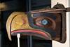
Seahawks unveil Alternate Logo
31 posts
• Page 1 of 1
Re: Seahawks unveil Alternate Logo
![]() by RiverDog » Wed Sep 06, 2017 5:06 am
by RiverDog » Wed Sep 06, 2017 5:06 am
My first impression isn't good, either. Looks a little too Demonic. But it's better than the stoned seagull.
-
RiverDog - Legacy
- Posts: 23995
- Joined: Sat Dec 14, 2013 10:52 am
- Location: Kennewick, WA, 99338
Re: Seahawks unveil Alternate Logo
![]() by Oly » Wed Sep 06, 2017 5:41 am
by Oly » Wed Sep 06, 2017 5:41 am
RiverDog wrote:My first impression isn't good, either. Looks a little too Demonic. But it's better than the stoned seagull.
I think that if you're going to turn the logo into a more totem-styled image, you need to return to the stoned seagull...or, as I prefer to think of it, the more authentic Native style of art
That old Hawks logo is still my favorite, probably in all of sports.
-

Oly - Legacy
- Posts: 775
- Joined: Sat Dec 14, 2013 10:01 pm
- Location: Middle of cornfields
Re: Seahawks unveil Alternate Logo
![]() by NorthHawk » Wed Sep 06, 2017 6:48 am
by NorthHawk » Wed Sep 06, 2017 6:48 am
It's too cartoonish for my taste.
- NorthHawk
- Legacy
- Posts: 10647
- Joined: Sat Dec 14, 2013 11:57 am
Re: Seahawks unveil Alternate Logo
![]() by RiverDog » Wed Sep 06, 2017 6:49 am
by RiverDog » Wed Sep 06, 2017 6:49 am
Oly wrote:I think that if you're going to turn the logo into a more totem-styled image, you need to return to the stoned seagull...or, as I prefer to think of it, the more authentic Native style of art. I don't think the new logo looks good this way.
That old Hawks logo is still my favorite, probably in all of sports.
I understand how the first logo got its start, and as a rule, I wouldn't object to it if not for the fact that it's representing of a football team. It's not too dissimilar to Tampa Bay's original logo featuring the winking pirate. Rather than 11 men dressed in armor preparing to go into battle, it conjured up images of actors in a musical dancing around on a stage wearing leotards.
-
RiverDog - Legacy
- Posts: 23995
- Joined: Sat Dec 14, 2013 10:52 am
- Location: Kennewick, WA, 99338
Re: Seahawks unveil Alternate Logo
![]() by Oly » Wed Sep 06, 2017 7:12 am
by Oly » Wed Sep 06, 2017 7:12 am
RiverDog wrote:I understand how the first logo got its start, and as a rule, I wouldn't object to it if not for the fact that it's representing of a football team. It's not too dissimilar to Tampa Bay's original logo featuring the winking pirate. Rather than 11 men dressed in armor preparing to go into battle, it conjured up images of actors in a musical dancing around on a stage wearing leotards.
Comparing the winking pirate to the original Hawks logo?! You go too far, sir!
But I do get why lots of people didn't like the old Hawks logo. It certainly doesn't fit with the aesthetic of NFL teams.
-
Oly - Legacy
- Posts: 775
- Joined: Sat Dec 14, 2013 10:01 pm
- Location: Middle of cornfields
Re: Seahawks unveil Alternate Logo
![]() by Hawk Sista » Wed Sep 06, 2017 8:00 am
by Hawk Sista » Wed Sep 06, 2017 8:00 am
I saw this yesterday and I don't get it. Why have an alternative logo at all, let alone this one? The original one is still my fave, too & I never saw a stoned seagul, I saw Native American art. I still do, and I like the meaner logo just fine. I think this thing is just weird looking, so they are obviously not trying to appeal to my demographic. Anyone know why we'd need an alternative logo?
-
Hawk Sista - Legacy
- Posts: 2429
- Joined: Sat Dec 14, 2013 10:58 am
- Location: Central California
Re: Seahawks unveil Alternate Logo
![]() by Uppercut » Wed Sep 06, 2017 10:28 am
by Uppercut » Wed Sep 06, 2017 10:28 am
Hope they are not going to use that on anything!
- Uppercut
- Legacy
- Posts: 583
- Joined: Sun Jan 12, 2014 6:23 pm
Re: Seahawks unveil Alternate Logo
![]() by Largent80 » Wed Sep 06, 2017 10:45 am
by Largent80 » Wed Sep 06, 2017 10:45 am
-

Largent80 - Legacy
- Posts: 1745
- Joined: Mon Apr 10, 2017 1:38 pm
- Location: Tex-ass
Re: Seahawks unveil Alternate Logo
![]() by Uppercut » Wed Sep 06, 2017 1:30 pm
by Uppercut » Wed Sep 06, 2017 1:30 pm
[/quote]
http://proshop.seahawks.com/[/quote]
I guess I can live with it on tees or underwear, hope they don't use it on the uniforms
http://proshop.seahawks.com/[/quote]
I guess I can live with it on tees or underwear, hope they don't use it on the uniforms
- Uppercut
- Legacy
- Posts: 583
- Joined: Sun Jan 12, 2014 6:23 pm
Re: Seahawks unveil Alternate Logo
![]() by burrrton » Wed Sep 06, 2017 1:53 pm
by burrrton » Wed Sep 06, 2017 1:53 pm
It looks like a chicken with hydrocephaly. My gawd.
-
burrrton - Legacy
- Posts: 4213
- Joined: Mon Dec 23, 2013 7:20 am
Re: Seahawks unveil Alternate Logo
![]() by Oly » Wed Sep 06, 2017 3:03 pm
by Oly » Wed Sep 06, 2017 3:03 pm
burrrton wrote:It looks like a chicken with hydrocephaly. My gawd.
Holy sh*t, that's it. You somehow made it even worse for me.
-
Oly - Legacy
- Posts: 775
- Joined: Sat Dec 14, 2013 10:01 pm
- Location: Middle of cornfields
Re: Seahawks unveil Alternate Logo
![]() by RiverDog » Wed Sep 06, 2017 5:28 pm
by RiverDog » Wed Sep 06, 2017 5:28 pm
burrrton wrote:It looks like a chicken with hydrocephaly. My gawd.
-
RiverDog - Legacy
- Posts: 23995
- Joined: Sat Dec 14, 2013 10:52 am
- Location: Kennewick, WA, 99338

Re: Seahawks unveil Alternate Logo
![]() by curmudgeon » Wed Sep 06, 2017 6:52 pm
by curmudgeon » Wed Sep 06, 2017 6:52 pm
Hawk head @ $59.95 coming soon......
-
curmudgeon - Legacy
- Posts: 807
- Joined: Fri Dec 27, 2013 1:15 pm
- Location: Kennewick, Washington 99337
Re: Seahawks unveil Alternate Logo
![]() by burrrton » Wed Sep 06, 2017 6:54 pm
by burrrton » Wed Sep 06, 2017 6:54 pm
c_hawkbob wrote:
Exactly. Ugh.
-
burrrton - Legacy
- Posts: 4213
- Joined: Mon Dec 23, 2013 7:20 am
Re: Seahawks unveil Alternate Logo
![]() by obiken » Wed Sep 06, 2017 11:43 pm
by obiken » Wed Sep 06, 2017 11:43 pm
I love it sorry, it looks B A D!!
- obiken
- Legacy
- Posts: 3962
- Joined: Sat Dec 14, 2013 4:50 pm
- Location: Wilsonville, Oregon 97070
Re: Seahawks unveil Alternate Logo
![]() by politicalfootball » Thu Sep 07, 2017 3:33 am
by politicalfootball » Thu Sep 07, 2017 3:33 am
No way that is ugly I vote no.
-

politicalfootball - Legacy
- Posts: 679
- Joined: Fri Dec 05, 2014 10:47 am
Re: Seahawks unveil Alternate Logo
![]() by RiverDog » Thu Sep 07, 2017 4:12 am
by RiverDog » Thu Sep 07, 2017 4:12 am
And to think that they actually pay people money to sit around and doodle like this.
-
RiverDog - Legacy
- Posts: 23995
- Joined: Sat Dec 14, 2013 10:52 am
- Location: Kennewick, WA, 99338
Re: Seahawks unveil Alternate Logo
![]() by Largent80 » Thu Sep 07, 2017 4:20 am
by Largent80 » Thu Sep 07, 2017 4:20 am
It looks like someone got their 5 year old Phootoshop.
-
Largent80 - Legacy
- Posts: 1745
- Joined: Mon Apr 10, 2017 1:38 pm
- Location: Tex-ass
Re: Seahawks unveil Alternate Logo
![]() by Feez » Thu Sep 07, 2017 7:47 am
by Feez » Thu Sep 07, 2017 7:47 am
I hope to one day refer to this time period as "remember when the Seahawks had that really stupid alternate logo for a week? "
-
Feez - Legacy
- Posts: 123
- Joined: Sat Dec 14, 2013 10:53 am
Re: Seahawks unveil Alternate Logo
![]() by obiken » Fri Sep 08, 2017 5:26 pm
by obiken » Fri Sep 08, 2017 5:26 pm
Feez wrote:I hope to one day refer to this time period as "remember when the Seahawks had that really stupid alternate logo for a week? "
I just totally disagree I think it's cool looking, we can all agree the main logo is the best! Now the Lime Unis? YUK!
- obiken
- Legacy
- Posts: 3962
- Joined: Sat Dec 14, 2013 4:50 pm
- Location: Wilsonville, Oregon 97070
Re: Seahawks unveil Alternate Logo
![]() by Largent80 » Fri Sep 08, 2017 6:30 pm
by Largent80 » Fri Sep 08, 2017 6:30 pm
Turn it upside down and do you see the moustache?
-
Largent80 - Legacy
- Posts: 1745
- Joined: Mon Apr 10, 2017 1:38 pm
- Location: Tex-ass
Re: Seahawks unveil Alternate Logo
![]() by EmeraldBullet » Fri Sep 08, 2017 11:43 pm
by EmeraldBullet » Fri Sep 08, 2017 11:43 pm
Might be the only one here that likes it, but I do.
-

EmeraldBullet - Legacy
- Posts: 487
- Joined: Mon Oct 26, 2015 12:55 pm
Re: Seahawks unveil Alternate Logo
![]() by c_hawkbob » Sat Sep 09, 2017 7:09 am
by c_hawkbob » Sat Sep 09, 2017 7:09 am
EmeraldBullet wrote:Might be the only one here that likes it, but I do.
Skimmer. Obi likes it too. Keep up man
-

c_hawkbob - Legacy
- Posts: 6970
- Joined: Sat Dec 14, 2013 3:34 pm
- Location: Paducah Kentucky, 42001
Re: Seahawks unveil Alternate Logo
![]() by Irish Greg 2.0 » Sat Sep 09, 2017 7:45 am
by Irish Greg 2.0 » Sat Sep 09, 2017 7:45 am
Hate it.
Hey Seahawks, if you are looking for marketing ideas... bring back the classic uniform for throwbacks.
A quarter of our bandwagon fan base probably has no idea we used to wear silver helmets ...
Hey Seahawks, if you are looking for marketing ideas... bring back the classic uniform for throwbacks.
A quarter of our bandwagon fan base probably has no idea we used to wear silver helmets ...
-

Irish Greg 2.0 - Legacy
- Posts: 248
- Joined: Thu Dec 19, 2013 12:16 pm
- Location: Colorado Springs, Colorado
Re: Seahawks unveil Alternate Logo
![]() by RiverDog » Sun Sep 10, 2017 4:51 am
by RiverDog » Sun Sep 10, 2017 4:51 am
Irish Greg 2.0 wrote:Hate it.
Hey Seahawks, if you are looking for marketing ideas... bring back the classic uniform for throwbacks.
A quarter of our bandwagon fan base probably has no idea we used to wear silver helmets ...
It's not just the Hawks, it's the entire NFL. It's like they're throwing whatever chit on the wall they can find in the hope that some of it might stick.
-
RiverDog - Legacy
- Posts: 23995
- Joined: Sat Dec 14, 2013 10:52 am
- Location: Kennewick, WA, 99338
Re: Seahawks unveil Alternate Logo
![]() by obiken » Sun Sep 10, 2017 1:15 pm
by obiken » Sun Sep 10, 2017 1:15 pm
Wow you guys are just haters huh?
- obiken
- Legacy
- Posts: 3962
- Joined: Sat Dec 14, 2013 4:50 pm
- Location: Wilsonville, Oregon 97070
31 posts
• Page 1 of 1
Who is online
Users browsing this forum: No registered users and 85 guests